
You Can’t Forbid Living Beautifully.

The smallest room in a standard apartment? The bathroom, more often than not. Limited square metres are no reason to stint on care and attention. This is a place where a fair share of our lives unfolds — statistics say a year and a half in the bath and six months in the toilet! Which means the BATHROOM deserves YOUR attention!
Let us pause for a moment and "refresh" our ideas about bathroom finishes and décor.
Remember your grandmother’s floor — that rough patterned tile, oil-painted walls, and plain 20×20 tiles, mostly white? Well, that is exactly what is in fashion now!
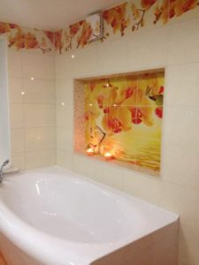
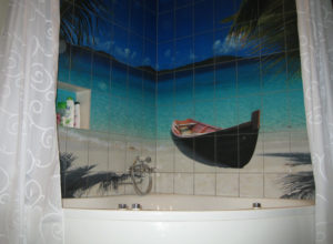
If you bought an apartment that is not a new build, where the last renovation was done last century, or you are only just starting the works — the one thing to get rid of at once is photo-print tile, so fashionable in the late 1990s and early 2000s.
Here are a few useful tips for positive, creative people who care about their living space.
For the finish, choose solid-colour textured or relief tile — for example, metro tiles ("kabanchiki") — it looks very stylish and sets a rhythm. And to save on cost, leave part of the wall surfaces for paint or wallpaper.
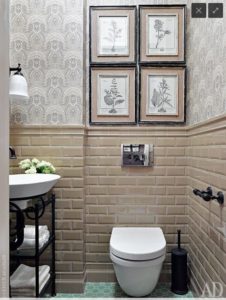
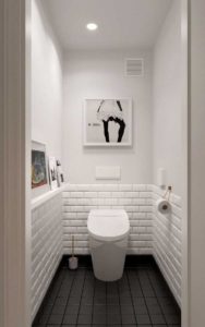
First, this will give the room a variety of textures; second, you will have FREE SURFACES for your IMAGINATION, which you can decorate! And simply by changing that décor alone, you can refresh the interior and set a different mood and theme in the room.
Option 1
Suppose you already have a bathroom finished to look like natural stone, with classic-style fixtures and cabinets. I would advise framing the mirror in a substantial frame and hanging a couple of paintings in moulded baguettes. Choose restrained works, not loud in colour.
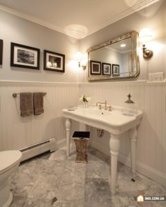
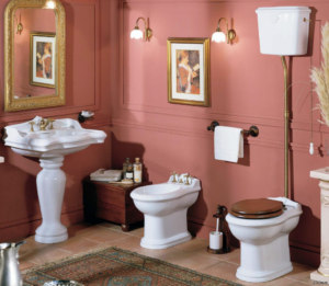
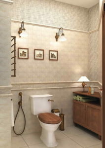
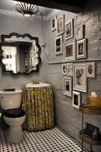
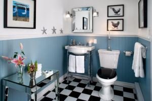
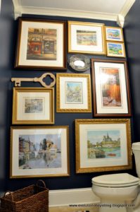
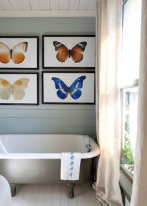
Hang paintings in an ordered way, observing the laws of visual connection. Here are a couple of examples of correct picture hanging.
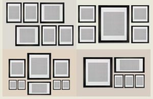
Option 2
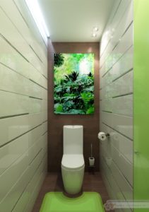
If your room has bright tile or paint — invent a theme. For example, blue — memories of the sea; green — a tropical forest or palms on the shore; red — winter and rowan. Everyone will have their own association with a colour. Yellow may evoke sun and sand, or it may evoke honey and Winnie-the-Pooh. Guided by your associations, begin to choose pictures and posters and frame them in contrasting frames. How many paintings you hang depends solely on your imagination and creative appetite.
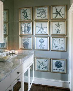
In this option you may hang pictures in a free, seemingly random order — the main thing is that they read as a single group.
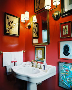
If there is a single large painting, hang it in relation to a particular space or object. For example, under a wall sconce or above the fixtures.
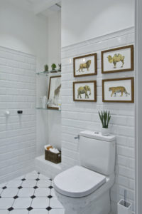
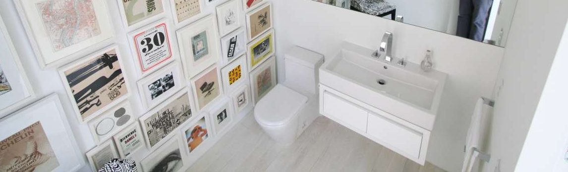
If you feel that paintings in the bathroom may suffer from humidity, give free rein to creative impulse in the powder room. Paper or paint the walls in one colour, and cover everything else from floor to ceiling with paintings, photographs, and mirrors in different frames. It will look stylish — and not like your neighbours’ or friends’ homes.
Remember: the absence of patterns on the tile you buy is not design simplicity — it is a beautiful, well-judged backdrop for unique, personal décor!
Now time spent in the bathroom takes on a creative character. Onward to making! You will surely succeed! And your apartment will gain yet another place where positive emotions can be found. Good luck!
Elizaveta Rtishcheva,
practising designer