
#mykvartiras
As the number of artists submitting works for consideration continues to grow by the hour, we have decided to hold a competition. Its winners will join our gallery and receive every privilege, access to seasonal vernissages, and much, much more. And the competition’s one and only overall favorite will be awarded a solo exhibition!
QUALIFYING ROUND
Dates: 28 February–21 May 2017
Terms:
- By 31 May, post one of your boldest, brightest, most daring and innovative artworks or photographs on Instagram with the hashtag #mykvartiras
- Wait for the semifinalists to be selected by the gallery’s curators and team
Good luck to everyone—we look forward to seeing you at #mykvartiras
Selection Round Results:
Of the more than one hundred works submitted to us by email, WhatsApp, and social media, we selected just 10.
10 artists who will continue competing in #mykvartiras.
And now the most exciting part begins. Three of the ten will become Kvartira S artists, with their work featured on our website, participation in seasonal exhibition openings, and the opportunity to take on gallery commissions. And one of the ten—the very best—will be awarded a solo exhibition.
We wholeheartedly thank everyone who submitted their work! Be bold, keep going, and pursue your aspirations. What is meant for you will never pass you by.
And now, of course, let us welcome the magnificent ten! (For now, we are keeping the artists’ names under wraps.)
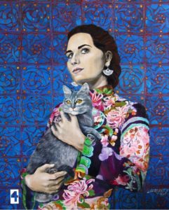
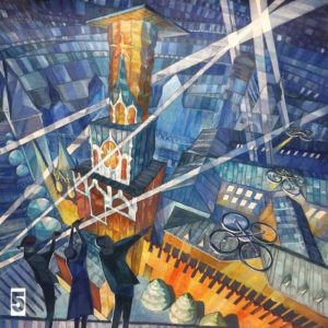
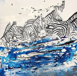
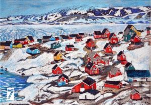

Geneviève Canto, artist, student of Salvador Dalí, founder and president of the Bandol Academy of Arts (translated from French):
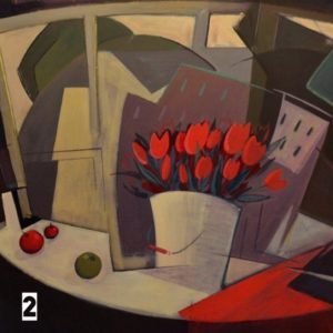
“I selected three works. First and foremost, painting No. 5: a beautifully structured composition, an allegory, a dreamlike subject. In second place is work No. 4: a very beautiful, harmonious painting that evokes Russia. The scene depicted—a woman holding a cat—conceals a certain message, and that is a virtue. It is a true hymn to a woman’s gentleness and tenderness. I would then like to highlight painting No. 2: it achieves harmony and is beautifully composed.”

Rosemary Thurman, creator of the TEORA Magazine fashion blog, Marie Claire columnist, and lecturer at the British Higher School of Art and Design and HSE:
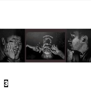
“I chose work No. 3 as my favorite—to me, it is a vivid reflection of contemporary life: social, complex, and at times unbearably misunderstood. It is a ‘photograph’ of real life, rather than the life found on each of our Instagram feeds—the context that exists in every form of visual art.”

Alexander Glikman, architect at Duomo AG Srl, author of more than 150 projects built in Russia, England, France, Italy, the Baltic states and the USA, laureate of professional architecture competitions:
"Of the works presented, I preferred the more realistic ones as more thoroughly developed (when one wants to reflect on what the author intended to say). Work No. 4, "Portrait with a Cat", struck me as the most vivid, "finished" piece. In it the artist conveys with considerable interest the mood and feelings for a beloved animal — a cat. The overall blue colour scheme is rich and is beautifully complemented by the bright Oriental fabrics of the girl's clothing. I am drawn to the realism and, at the same time, the softness in the artist's manner of painting — clearly that of a highly skilled woman painter.
Work No. 3, "Portrait Triptych", seems to me worthy of attention. In this piece one senses a powerful character and the artist's unmistakable mastery. The figure is a representative of the northern peoples, with a very distinctive face, and the artist has superbly captured and conveyed precisely that. One wants to look at this work and imagine the life that fills this character, and what melody he is playing".

"I would single out work No. 2. A complete work of art — harmonious both stylistically and compositionally. There is both depth and light. For a painting in the interior genre this is a finished narrative that has no fixed scale. It could be a small study, for example, in gouache. Or a large-scale painting in acrylic, as the artist has done.
The next work is No. 3. Black paper and white pencil. The mastery of technique commands great respect for the artist. But beyond technique, the essential thing in this work is the subject, the states of being, the depth of emotion and feeling, immersion in sound. Empathy and engagement, interactivity — that is what matters most in the triptych".

Alla Alyoshina, journalist, culture desk critic. Has worked at the weekly "Argumenty i Fakty", at "Helikon-Opera", the "House of Music", the "Moscow Easter Festival", the New Jerusalem Museum and Exhibition Complex, and the Moscow Regional Philharmonic:
"My choice: work No. 5 — an entirely contemporary vision of Moscow. Here she is young, dynamic, and charged with the energy of the future. A remarkable colour palette, a subtle play of planes and complex perspectives. And work No. 3 — the artist once again proves that the human face can be the most absorbing object of study".

"I vote for the zebras, painting No. 6. It has dynamism, color, lightness, and a powerful positive energy, which makes it a perfect fit for any interior, even an office."

Ilona Boleishits, architect and decorator, head of the AR-KA architectural bureau, whose accolades include numerous awards and competition victories, among them a First-Degree Diploma at ARCH Moscow 2017:
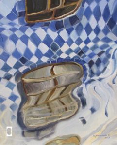
"I chose two works. No. 8, "Windows in the Water," is a delicate painting that evokes shifting sensations. I am drawn to subtle, understated elegance and contemplation. Once again, its color scheme is uncontrived, yet never obvious.
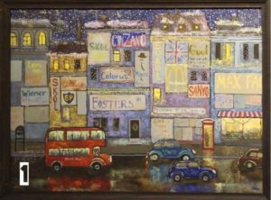
And No. 7, "Houses in the Snow." Despite its very straightforward subject and simple colors, it can evoke different associations depending on the viewer’s context and life experience. It brings to mind beads, rowan berries, and sugar-coated cranberries."

Alexander Rygorchuk, curator of the Kvartira S Gallery, artist, designer, decorator, specialist in contemporary interior design, decoration, and artwork for residential and office spaces, owner of the Art Kitchen studio, and art director of the Kale-Color design and décor studio:
"I vote for the zebras because this painting, with its restrained color palette yet sufficiently dynamic composition, would suit any contemporary interior. And if it measures 1 × 1 meter, all the better!
I was also drawn to the northern landscape with the little houses. Where would we be without the classics? This painting, by contrast, would look wonderful in an old house belonging to someone’s grandmother somewhere in Europe. In terms of format, it is a miniature—like a "postcard" from a relative or close artist friend traveling the northern seas—and it would certainly catch my eye..."

Alina Aksyonova, art history lecturer at the Pushkin State Museum of Fine Arts, archaeologist, and art history teacher:
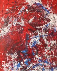
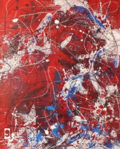
"I prefer No. 9 because it recalls Jackson Pollock at his finest.
And No. 6—for the sweeping momentum of its composition and its delicate color."

Kristina Eroshkina, curator of the Kvartira S gallery, art historian, organizer of educational art projects for children and adults in collaboration with art historians from Moscow State University, RSUH, the Pushkin State Museum of Fine Arts, and the Tretyakov Gallery:
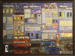
"I liked painting No. 1 for its mood, for the way the artist, despite the childlike quality of the drawing, conveyed the atmosphere of the city. I also choose painting No. 6 for its dynamism and energy".

Alexander Belyaev, journalist, music critic, English translator, published in Play, Billboard, Rolling Stone, TimeOut, where Moscow, Vedomosti, Novaya Gazeta, Moskovskiye Novosti, and others. His translations include Eric Clapton’s autobiography, the AST series “The Story Behind the Songs” (about the RollingStonesLedZeppelin, Metallica, John Lennon), and Stephen Witt’s study of piracy, How Music Got Free:
"I chose the canvas numbered 1 — it immediately caught my eye, and after I looked through the other paintings, which are also very fine, this number one never left me. Why? Hard to say. Or too easy — there is movement, the life of a big city steeped in jazz rhythms, a retro mood and a kind of naive gaze… a fine stylization of ‘naïve art'!"

Yuri Averchenkov, psychologist, screenwriter:
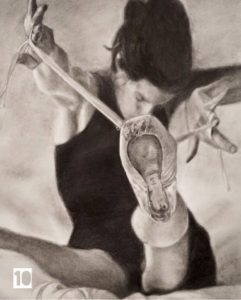
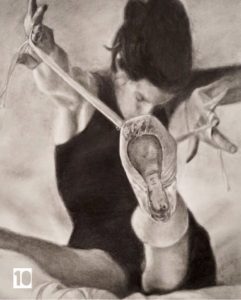
"I vote for painting No. 10. Here, with what seems a simple combination of black and white, the artist manages to create tension, to show plasticity, mood, and character that draw the eye and let you feel the figure. Through expressive details a human destiny comes into view, and one senses a full, compelling story of a single life".

COMPETITION FINAL
The "Become a Gallery Artist" competition has reached its finale, and we congratulate its finalists:
Arzhan Uteyev,
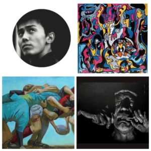
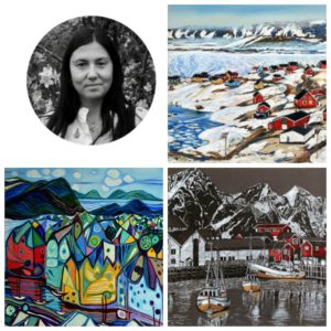
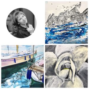
All three are winners; their pages can be found in our catalogue, and their works are available for purchase!
But that is not all:
by 1 October we will choose one artist who will receive the main prize — a solo exhibition from the Kvartira S gallery. You, our visitors, will choose!
To vote for the most deserving artist, like their photo on our social media pages: Facebook, VKontakte, Instagram. The number of likes is tallied across all three social networks. The artist with the most likes will receive a solo exhibition as a gift!
Good luck to everyone.